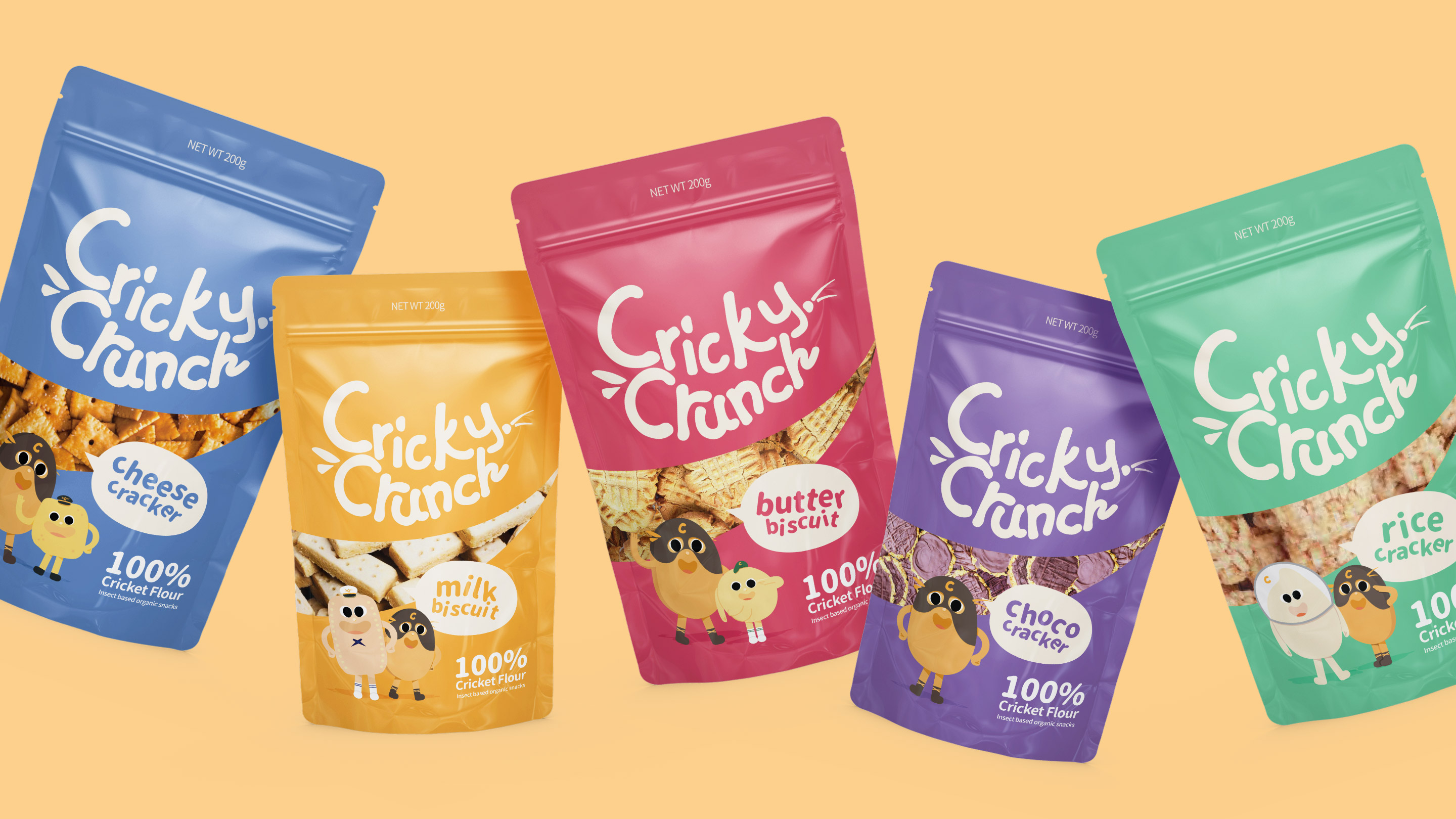
Cricky Crunch Is a brand dedicated to the promotion and use of alternative and sustainable methods to promote healthy eating. Not only do insect-based products have a higher nutritional value, but the manufacture of insect-based products is also so much better for the environment. However, we understand that not everyone is as open to switching to healthier insect-based alternatives (even though two billion people already eat insects on a regular basis). Therefore, by focusing on providing insect-based snacks for school children, we aim to normalize insect-based ingredients within society and introduce the societal change.
LOGO
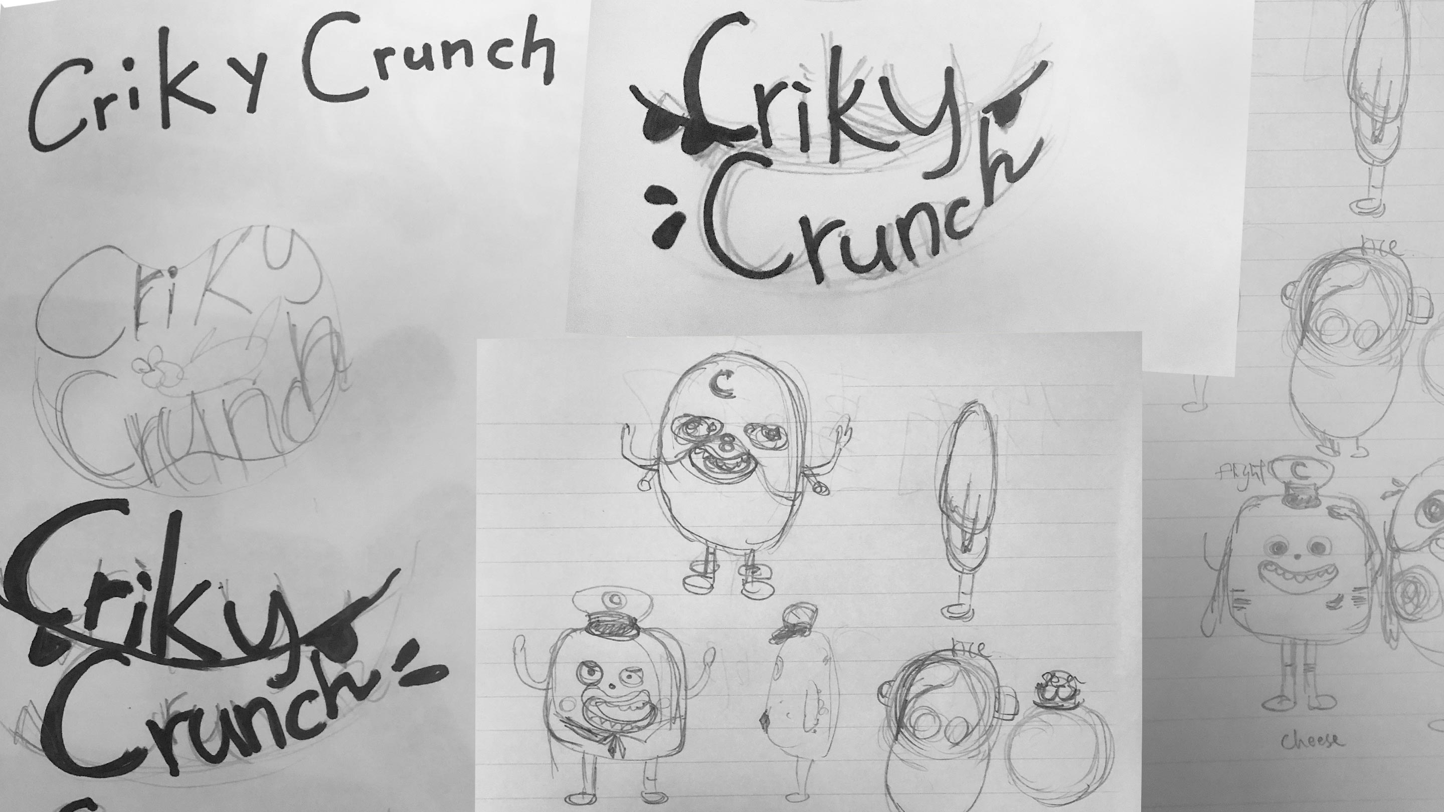
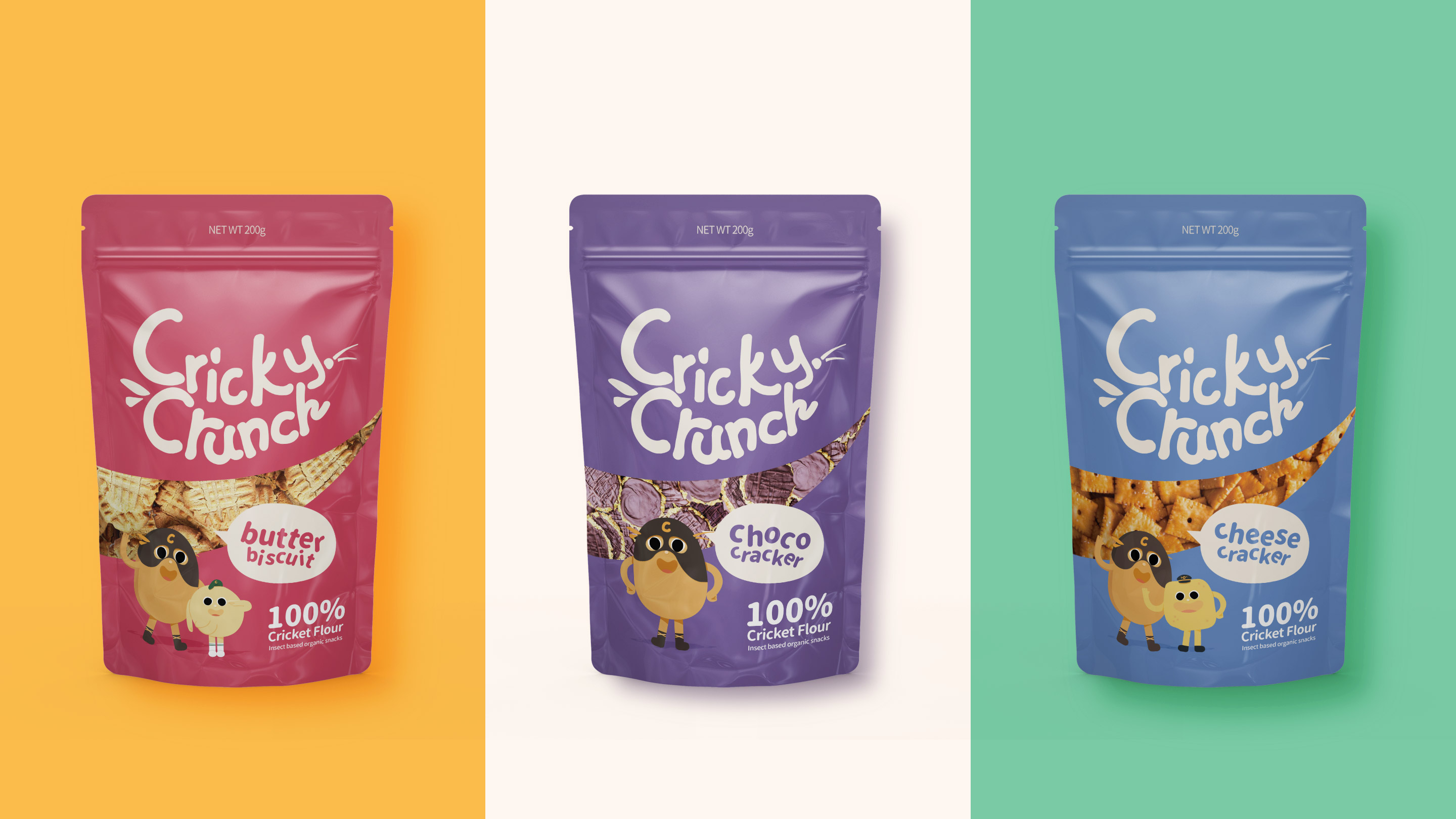
The logo look was selected with playful and fun, which shows a bit like a child's graffiti. The shape of the characters“Cricky Crunch” refers to the image of the teeth that is shown because of eating mouth opens widely. In the meantime, a little grasshopper on the side, which indicates it is an insect-base snack brand.